2025
Travel Booking & Wallet Mobile App
Simplifying Group Travel and Payments
The aim of this project was to create a solution that eases the pressure while arranging a business trip or family holiday, with integrated payments and bill splitting.
The client came to us to design the key concept screens of the application as a prototype in aim to receive investment for the full development project.
The Problem
With an abundance of travel booking applications and websites, there has been a standard process set that all providers tend to follow. The client performed their own user research and found there were some gaps that could be improved within the travel process across all user types.
Having had experience within the financial industry, and being involved in the building of many payment providers, the client wanted to allow users to split the bill of all travel receipts before, during and after the trip.
My Solution
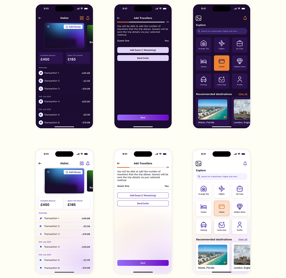
There are 2 main components within this application concept; searching to book a trip, and a wallet which users can pay into, make payments with and split their transactions with other users.
I researched popular travel systems to understand the common pain points that the users had raised. A key missing feature was selecting the number of rooms before selecting the property, as this seemed to be limited to a selection of people travelling in the initial search.
To resolve this, I included an additional field on the search drawer to allow users to define a more detailed search from the start. To not deviate away from the process that users are so familiar with, I ensured the later steps followed the common travel booking practices.

As this project was a prototype, I suggested creating light and dark mode versions to further help present the idea to investors through multiple visuals.
The client had a very specific set of colours they wanted to use for their graphics; purple and orange. These colours were something they wanted to transition seamlessly across both modes, so users would still get the consistent brand feel, whichever colour way they preferred.